Data Wednesday: Interpreting the Map
By
Becky Sweger
Posted:
|
Transparency & Data
This is the second installment of our weekly posts about the Federal Priorities Database. Last week, we ran a database search, creating a map of results.
The next step is interpreting the map. Here’s an example I created by running a search on Unemployment Insurance expenditures.
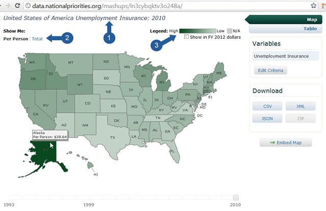
The three most important things to look at on the map are the title, the measures, and the legend:
- The map’s title describes the dataset you’re looking at and also shows the year currently on display.
- Some data can be viewed in different ways—for example, in per person amounts, as percentages, or as state-wide totals. When that’s the case, the available measures are listed under Show Me in the upper-left corner of the map. We’ll talk more about these measures in a future post.
- The other critical orienting feature is the map’s legend. Essentially, the legend says that darker shades on the map represent larger numbers than lighter shades.
Armed with that knowledge, you now know we’re looking at a map of federal unemployment insurance spending for fiscal year 2010. Furthermore, we can see that Alaska residents received more per-person money for this program than any other state.
To see the exact total, move your mouse over Alaska. A tool-tip should pop up and let you know that the amount is $38.64. Remember, we're viewing per person spending, so this number is the total federal spending on unemployment insurance in Alaska divided by Alaska's population.
Next week, we’ll talk about viewing the data over time (hint: there is a year slider underneath the map!). As always, feel free to get in touch if you have any questions.