State Smart: Federal Funds in 50 States
Nov. 20, 2014 - Download PDF Version
NPP's State Smart offers an easy-to-use look at dozens of ways that federal dollars flow between states and the U.S. Treasury. This report examines the influence of the Great Recession on these dynamics and their impact on our everyday lives.
Contents
Introduction
Why States?
Money Traveling Into States
Money Leaving the States
Conclusion
State Tables
Notes and Sources
I. Introduction
The federal budget has hugely important, but often unrecognized, influence on the lives of all Americans. Everyone pays into the federal budget through taxes, and everyone benefits from it through public services, infrastructure, national security, and economic activity driven by federal investments and employment. Yet many Americans do not know how our federal government spends our tax dollars or how federal funding comes to our communities.
For more than 30 years National Priorities Project (NPP) has cracked open the federal budget—what we believe should be the people’s budget—to give all Americans access to information about how it affects their lives. NPP’s interactive tools make the budget tangible and personal, illustrating the various ways federal dollars play a critical role in the issues Americans care about the most.
In that vein, NPP has just released State Smart, a comprehensive source for tracking the flow of federal money at the state level: http://www.nationalpriorities.org/smart.
For the first time since 2010, the last year available from Census Bureau’s now-discontinued Consolidated Federal Funds Report (previously the best source for data on federal spending in the states), State Smart offers Americans an easy-to-use look at dozens of ways that federal dollars come into the states and vice versa.
This report, based on the State Smart website and datasets, examines key findings about how the U.S. spends in the states as well as states’ tax contributions back to the U.S. Treasury.
II. Why States?
Every day, residents of each state in the U.S. are affected by the federal budget. Federal dollars show up in states through public services, roads and bridges, public assistance programs, clean air and water, and much more. Residents pay taxes to the federal government, send their children to schools that receive federal funds, and benefit from economic activity generated by federal employees or contractors.
Localizing federal spending numbers to the state level is an important way to understand the role of the federal budget in our everyday lives.
A Note About "Money In" vs "Money Out"
While we believe it is critically important and useful for Americans to understand what their state pays in to the budget and what it receives, the complex relationship between federal taxes and benefits doesn’t fit neatly into a geographic framework.
- Many federal initiatives benefit the entire country, not just the state where they’re located. For example, the Centers for Disease Control and Prevention operates in Georgia, but its mission is to “protect America from health, safety, and security threats, both foreign and in the U.S.”
- Social Security and Medicare benefits reflect payroll taxes paid across the country over decades—not necessarily the recipient’s current home state.
Classifying states as budget “givers” or “takers” doesn’t fully capture these nuances and doesn’t acknowledge, for example, that many federal programs are progressive. In other words, they are designed to deliver more benefits to those who need them the most. The federal budget is intended to serve the needs of the nation as a whole. For these reasons, State Smart does not publish direct comparisons between federal dollars coming in to states and the federal taxes that their residents pay.
Data Sources
NPP compiled State Smart by using data from the U.S. Census Bureau, the U.S. Bureau of Economic Analysis, USASpending.gov, and the Internal Revenue Service. A complete list of the data sources and methodology can be found on the project’s website: https://www.nationalpriorities.org/smart/resources/notes-and-sources/.
All dollar amounts in this report are expressed as federal fiscal year 2014 dollars.
III. Money Traveling Into States
This report explores federal spending trends during and after 2007, the start of the Great Recession.[1] Although the recession officially ended in 2009, it continues to influence the flow of federal dollars in and out of U.S. states. The story that emerges shows a significant impact from the economic stimulus (the American Recovery and Reinvestment Act) and increased spending on safety net programs during recent years.
The sections below examine key ways that federal dollars come to the states:
- federal aid to individuals
- federal grants to state and local governments
- federal employees and contracts
We also look at state contributions to the federal budget through tax collections over time.
Federal Aid to Individuals
The majority of federal dollars in the states represents money that people receive directly—mostly in the form of Social Security and Medicare benefits.[2] This analysis includes both of these programs and their dedicated payroll tax funding streams for two reasons. First, State Smart examines the totality of federal spending: Social Security and Medicare are important pieces of the overall picture. Secondly, Americans continually rank Social Security and Medicare as top priorities for lawmakers.[3] Americans want to ensure that both are sound and able to deliver for years to come.[4]
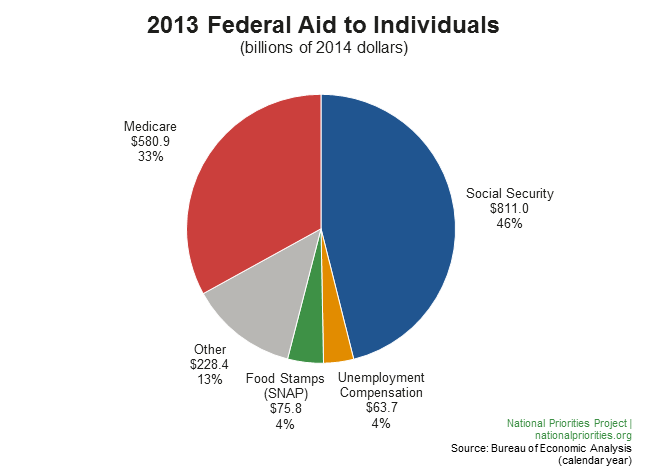
Figure 1: 2013 Federal Aid to Individuals
Federal Budget in the Field
"Social Security is an enduring and time-tested program that provides a critical source of income to Americans at every income level and in every state. Americans know they pay for the program through deductions from their pay, and large majorities agree it is important to preserve Social Security for future generations, even if that means raising Social Security taxes working Americans pay."
— Virginia Reno, Vice President of Income Security, National Academy of Social Insurance
Beyond Social Security and Medicare benefits, federal aid to individuals is a way of planning for the worst. This funding includes food stamp (SNAP) and unemployment compensation benefits, which expand and contract as needed based on eligibility. For example, between 2007 and 2010—a period that includes the Great Recession—Food Stamp (SNAP) benefits more than doubled, and unemployment benefits nearly tripled as the safety net expanded (see Figure 2: Per-Person Aid to Individuals: Food Stamps and Unemployment Compensation). Across programs, the per-person amount of federal aid has increased by 24% since 2007.[5]
Other money spent as aid to individuals is a mixture of funding, from Veterans’ benefits to Pell Grants to student National Science Foundation grants.
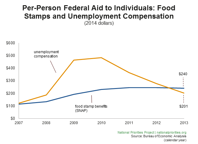
Figure 2: Per-Person Aid to Individuals: Food Stamps and Unemployment Compensation
In 2013, federal aid to individuals came out to about $5,566 for every person living in the U.S. However, the per-person number varied greatly between individual states, ranging from $3,568 in Utah to $7,239 in West Virginia.
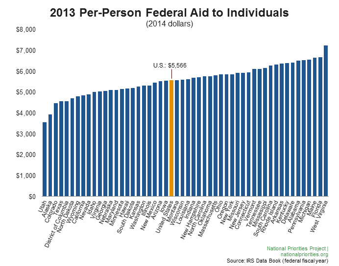
Figure 3: 2013 Per-Person Federal Aid to Individuals
Federal Grants to State and Local Governments
Another way that federal money gets to the states—and another important aspect of the social safety net—is through federal grants to state and local governments.
Every state budget in the U.S. relies on federal grants. In 2012 that money—over $529 billion—made up 32% of states’ general revenue.[6] Over half of that $529 billion (57%) came in the form of public assistance money, which the states, in turn, distributed to residents who benefit from programs like Medicaid, Temporary Assistance to Needy Families (TANF), and the Low Income Home Energy Assistance Program (LIHEAP).[7] Medicaid is by far the largest portion of public assistance grants going to the states, making up 80% of the total.[8]
Many of these programs saw increased funding from the 2009 American Recovery and Reinvestment Act (Recovery Act), expanding the safety net even further as unemployment rose.
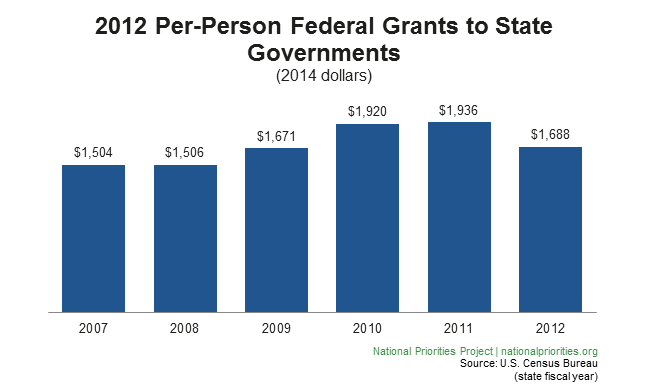
Figure 4: 2012 Per-Person Federal Grants to State Governments
The rest of the federal grant money to states funds a range of initiatives familiar to most Americans, including:
- Head Start
- School nutrition programs
- Highway and public airport projects
- Special Supplemental Food Program (WIC)
- Care of veterans in state hospitals
- EPA Superfund grants
- Rent subsidy programs (Section 8)
- Aid for natural resources like forests, soil, and water
- Meat inspection
Federal grants to local governments are considerably less than grants to state governments, but they’re an important way that communities are directly impacted by the federal budget. In 2011 (the latest available data), local governments received $76 billion in federal grants. A considerable portion of that money (42%) funds housing and community development initiatives like the construction of public housing and rent subsidy programs.
Federal Contracts and Federal Compensation
The federal government performs work in every state, through its own employees and by hiring private contractors. Federal contractors perform a variety of tasks from supplying the military with weapons to building websites. Other work, like research at New Mexico’s Los Alamos National Laboratory and the National Institutes of Health’s intramural facilities, is accomplished primarily via federal employees.
Federal Contracts
In 2013 the U.S. paid about $468.8 billion to federal contractors (including contractors who performed work in other countries).[9] The U.S. Department of Defense manages the vast majority of that money—almost 67% of it.[10] That’s about $990 for every person living in the United States.[11]
Federal Budget in the Field
"Dollars for weapons manufacture are an important subsidy for Connecticut. Preventing loss of well-paid jobs is one major reason Congress continually funds the Pentagon. What if most of that money instead created great jobs that build a green civilization?"
— Henry Lowendorf, Chair, New Haven Peace Council
In fact, four agencies managed 80% of all federal contract money in 2013.[11]
| Department | 2013 Contract Totals (billions of 2014 dollars) | Per-Person (2014 dollars) | Percent of Total Contract Dollars |
|---|---|---|---|
| Department of Defense | $312.9 | $990 | 66.8% |
| Department of Energy | $24.3 | $77 | 5.2% |
| Department of Health and Human Services | $20.3 | $64 | 4.3% |
| Department of Veterans Affairs | $18.6 | $59 | 4.0% |
Table 1: 2013 Federal Contract Dollars (source: USASpending.gov)
And while these numbers total hundreds of billions of dollars, 2013 actually represents the fifth straight year of an overall decline in federal contract spending.[10]
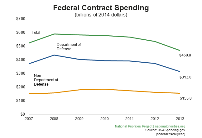
Figure 5: Federal Contract Spending
As the biggest spender, the Department of Defense was responsible for most of this fluctuation—it spent 30% less on contracts in 2013 than it did in 2008. [10]There are a few reasons for this:
- The drawdown of resources in Afghanistan and Iraq.
- The end of contracts funded by the American Recovery and Reinvestment Act (aka, the Recovery Act).
- Sequestration, which went into effect in February 2013.
It’s important to keep that 30% drop in perspective, however. The Department of Defense still significantly outpaces all other departments in spending on federal contracts, and there’s no indication that pattern will change anytime soon. In addition, the Pentagon knows how to use creative tactics to avoid the budget-cutting impact of the sequester.
Federal Compensation
Almost 5% of all compensation in the United States—in other words, wages plus benefits—is paid to people who work for the federal government. In 2013 there were over 4.8 million federal employees in the U.S.,[12] and they earned more than $440.5 billion in base salary and employer contributions for health insurance, retirement plans, Medicare, and Social Security.[13]
Federal Budget in the Field
"Federal dollars flowing into New Mexico play an important role in contributing to its economy. Federal workers at the Los Alamos National Laboratory do work that benefits the whole country, but those workers buy their groceries in New Mexico grocery stores, get back-to-school clothes in New Mexico department stores, and support local businesses. It's a critical piece in both good times and bad."
— Gerry Bradley, Senior Researcher and Policy Analyst, New Mexico Voices for Children
Average annual federal compensation is higher than the average for U.S. workers as a whole ($90,686 versus $62,992),[14] though there are many nuances to consider when comparing these numbers. The Congressional Budget Office tackled the question of federal and private sector pay in a 2012 report[15] and found the following:
- Federal workers tend to be older, more highly educated, and more concentrated in professional occupations than private-sector workers.
- The gap between high and low income earners has been growing in the U.S.,[16] but the span between the wages of high-and low-paid workers was narrower in the federal government than in the private sector.
- The federal government contributes more to its employees’ benefits than private sector employers.
NPP’s analysis confirms that last point about federal benefits. In 2013, benefits represented 30% of federal compensation but just 19% of compensation for the average U.S. worker. That gap has increased over the last ten years as federal employees received a greater share of their compensation in benefits, while employees overall received a smaller share of their compensation in benefits[17]
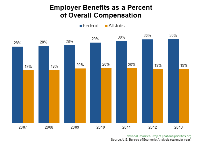
Figure 6: Employer Benefits as a Percent of Overall Compensation
IV. Money Leaving the States
Like federal spending, since 2007, the money that states contribute to the federal budget has also reflected the impact of the Great Recession. Their declining contributions counterpoint the rise in spending driven by the expansion of the safety net and the 2009 Recovery Act.
Why is this the case? State residents pay into the federal budget through income, business, payroll, estate, and gift taxes, as well as excise taxes on items like gasoline. When people are out of work, income tax collections decline as do other tax-generating activities. Thus the federal government receives less revenue overall from states.
In 2013, federal tax collections totaled $2.5 trillion,[18] most of which were taxes paid by or on behalf of individuals. Individual taxes—$2.17 trillion in 2013 [18]—include income and self-employment taxes and payroll taxes that fund Social Security and Medicare. That number has been adjusted to reflect money refunded as part of the Earned Income Tax Credit the Child Tax Credit.
A distant second to individual and payroll taxes, at about 11% of total federal tax revenue, are the taxes paid on profits earned by businesses. This pattern is also true at the state level: in all but four states, individuals pay more in federal taxes than do businesses. The four states where business taxes represent more than 20% of total federal tax payments are Nebraska, Arkansas, Rhode Island, and Delaware.[18]
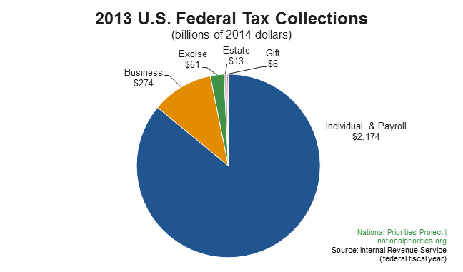
Figure 7: 2013 U.S. Federal Tax Collections
Between 2007 and 2010, federal tax collections declined by nearly 25%.[18] Although the numbers have been rising in recent years, as of 2013 they were not yet back to their pre-recession amounts. Also of note is the shrinking share of business taxes during the recession. In 2007, business contributed 15% of overall federal taxes; by 2010 that number had dropped to less than 10%.
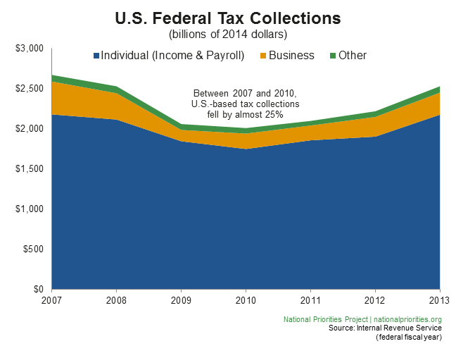
Figure 8: U.S. Federal Tax Collections
V. Conclusion
Although the Great Recession officially ended in 2009, it continues to influence the flow of federal dollars in and out of U.S. states. It’s critical for taxpayers to understand how these dynamics impact state economies and their everyday lives.
State Smart clearly shows that between 2007 and 2010, most states received an uptick in federal funds, while at the same time they were sending fewer dollars back to the federal budget. This pattern is expected during and immediately after a recession—it means that the social safety net is functioning as designed, and it reflects the efforts of the federal government to create jobs and spur spending through stimulus programs.
This point is important. While a properly functioning safety net clearly benefits those unfortunate enough to fall on hard times during an economic downturn, we all benefit from the stabilizing impact such federal expenditures have on the overall economy.
A 2013 Congressional Research Report cited the dangers of a hasty post-recession end to such stimulus programs and found that the U.S. has not yet recovered to the point where policy should prioritize debt reduction over near-term growth.[19] Thus, the overall trends in our data are not surprising.
Other drivers of recent federal spending increases are earned benefits programs that have dedicated funding streams: Social Security and Medicare. Lawmakers should take the lead to ensure that these popular programs remain viable for future generations.
A healthy democracy thrives best with an informed and engaged citizenry. Understanding how the federal budget impacts our lives is critical to that process. For many people—those relying on successful programs like Social Security—the importance of federal spending is readily apparent. For the rest of us, seeing the many ways in which federal funds flow into our states helps us better appreciate the role that our public spending plays in laying the foundation for strong families, safe communities, and a vibrant economy. State Smart provides citizens with important tools to better understand, and in turn influence, the ways in which our federal dollars are spent.
State Tables
Visit NPP's Federal Priorities database to view and map the State Smart datasets used in this report. Alternately, the report's PDF version appendices with the following state-level tables:
- Federal Aid to Individuals
- Federal Grants to State Governments
- Federal Contracts
- Federal Compensation
- Federal Taxes
Notes and Sources
A complete description of State Smart’s data and methodology can be found on the project’s website: https://www.nationalpriorities.org/smart/resources/notes-and-sources/.
All dollar amounts in this report are expressed as federal fiscal year 2014 dollars. The endnotes below refer to numbers specific to this report.
Endnotes
- National Bureau of Economic Research, US Business Cycle Expansions and Contractions (Accessed November 2014).
- U.S. Bureau of Economic Analysis, Table SA35 (Accessed September, 2014). Numbers represent calendar years.
- Pew Research Center, Deficit Reduction Declines as Policy Priority (Accessed November 2014).
- National Academy of Social Insurance, Americans Make Hard Choices on Social Security: A Survey with Trade-Off Analysis (Accessed November 2014).
- U.S. Bureau of Economic Analysis, “Table SA35” and U.S. Census Bureau, 2013 Population Estimates (Accessed September 2014). Numbers represent calendar years.
- U.S. Census Bureau, State Government Finances, 2012 Annual Survey of State Government Finances Summary Table (Accessed September 2014). Numbers represent state fiscal years.
- U.S. Census Bureau, State Government Finances, Flat Data File (Accessed September 2014). Numbers represent state fiscal years.
- USASpending.gov, Prime Award Spending Data, CFDA 93.778 grant totals, 7/1/2011-6/30/2012 (Accessed November 2014). This period corresponds to July – June fiscal year used by most states. States with a different fiscal year calendar are Alabama, Michigan, New York, and Texas.
- USASpending.gov, Prime Award Spending Data, All Agency Contracts full archive files, Dollars Obligated (Published 8/15/2014). Numbers represent federal fiscal years.
- USASpending.gov, Prime Award Spending Data, All Agency Contracts full archive files, Major Agency Category/Dollars Obligated (Published 8/15/2014). Numbers represent federal fiscal years.
- USASpending.gov, Prime Award Spending Data, All Agency Contracts full archive files, Major Agency Category/Dollars Obligated (Published 8/15/2014) and U.S. Census Bureau, 2013 Population Estimates (Accessed September 2014). Numbers represent federal fiscal years.
- U.S. Bureau of Economic Analysis, Table SA27N (Accessed September 2014). Numbers represent calendar years.
- U.S. Bureau of Economic Analysis, Table SA06N (Accessed September 2014). Numbers represent calendar years.
- U.S. Bureau of Economic Analysis, Tables SA06N, and SA27N. Average federal compensation calculated as total federal compensation (civilian and military) divided by total full and part-time federal employees (Accessed September 2014). Numbers represent calendar years.
- Congressional Budget Office How Does the Compensation of Federal Employees Compare With That of Workers in the Private Sector http://cbo.gov/publication/42865. Accessed November 2014.
- Pew Research Center, U.S. Income Inequality, on Rise for Decades, is Now Highest Since 1928 (Accessed November 2014).
- U.S. Bureau of Economic Analysis, Tables SA07N, SA06N, and SA27N. (Accessed September 2014). Average federal compensation calculated as above. Average federal wage/salary calculated as total federal salary/wage (civilian and military) divided by total full and part-time federal employees. U.S. averages are calculated using total U.S. compensation and salary/wage numbers. Amount of compensation attributed to benefits calculated as total compensation minus total salary/wage. Numbers represent calendar years.
- Internal Revenue Service, IRS Data Book, Tables 5 and 8 (Accessed September 2014). Total taxes calculated by subtracting refunds from gross collections.
- Congressional Research Service, Economic Recovery: Sustaining U.S. Economic Growth in a Post-Crisis Economy (Accessed November 2014).
Update 11/21: corrected a transcription error in total U.S. contract amount